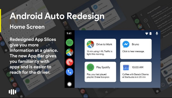
What do you think about this Android Auto redesign concept?
From controlling your music to following turn-by-turn navigation, Android Auto does a good job at helping you perform various tasks in a safe fashion while on the road. Android Auto received an update back in November to improve the UI for browsing and controlling media playback, but a new concept imagines what an even deeper Android Auto redesign could look like.
The biggest change in this mockup is the home screen. The upgraded App Bar shows icons for specific apps rather than generic options for phone calls, music, and navigation. If you wanted to change what apps were shown here, all you'd have to do is hold down on one and tap the app in that category you want to switch to (for example, hold down on Google Maps to change it to Waze).
Android Auto's home screen currently shows things like notifications, the weather, and recommended directions, but this concept has it using Android Pie's App Slices to show upcoming calendar appointments, suggested Spotify songs to listen to, and more in a more compact, information-dense layout.
Other changes include a less obtrusive Google Assistant UI, phone calls and notifications being shown on the left page next to the home screen as to not block what you're currently doing, and easier music controls.
Although this is just a concept from a regular Android Auto user, it's still an exciting look at what the platform could look like with a few simple changes.
Source : Android Studio


Comments
Show comments Hide comments